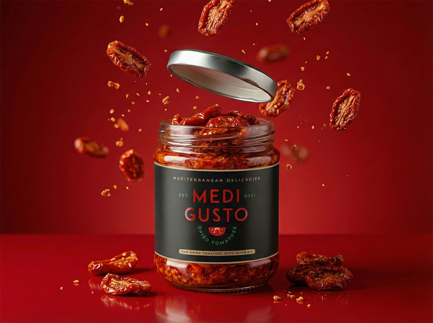
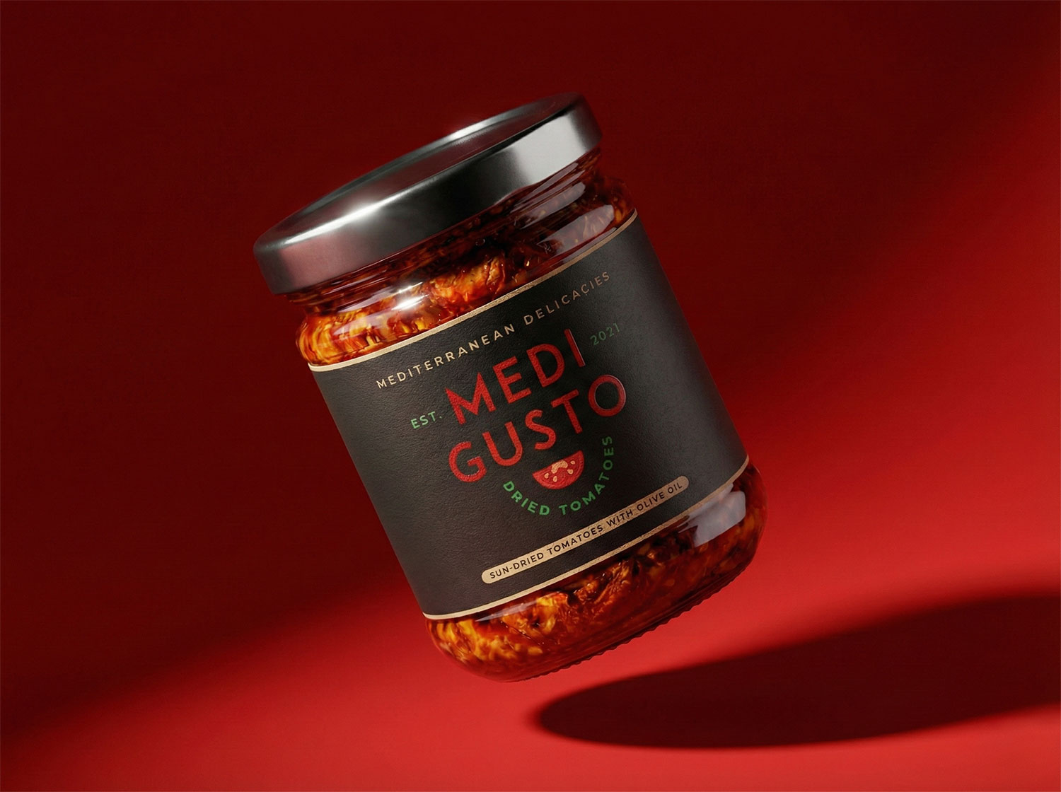
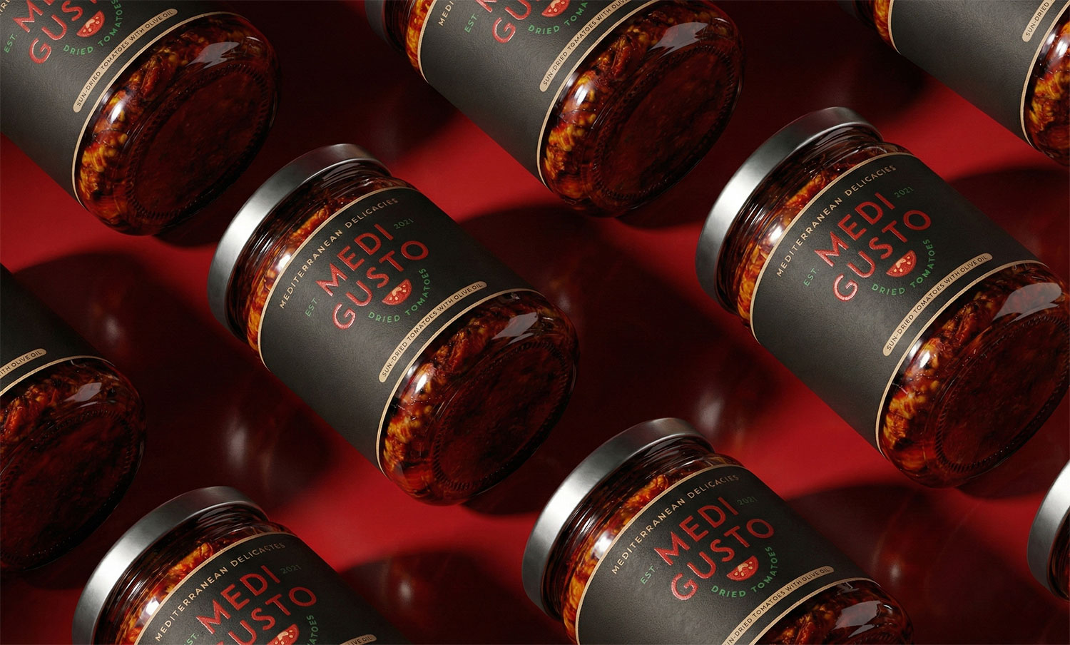
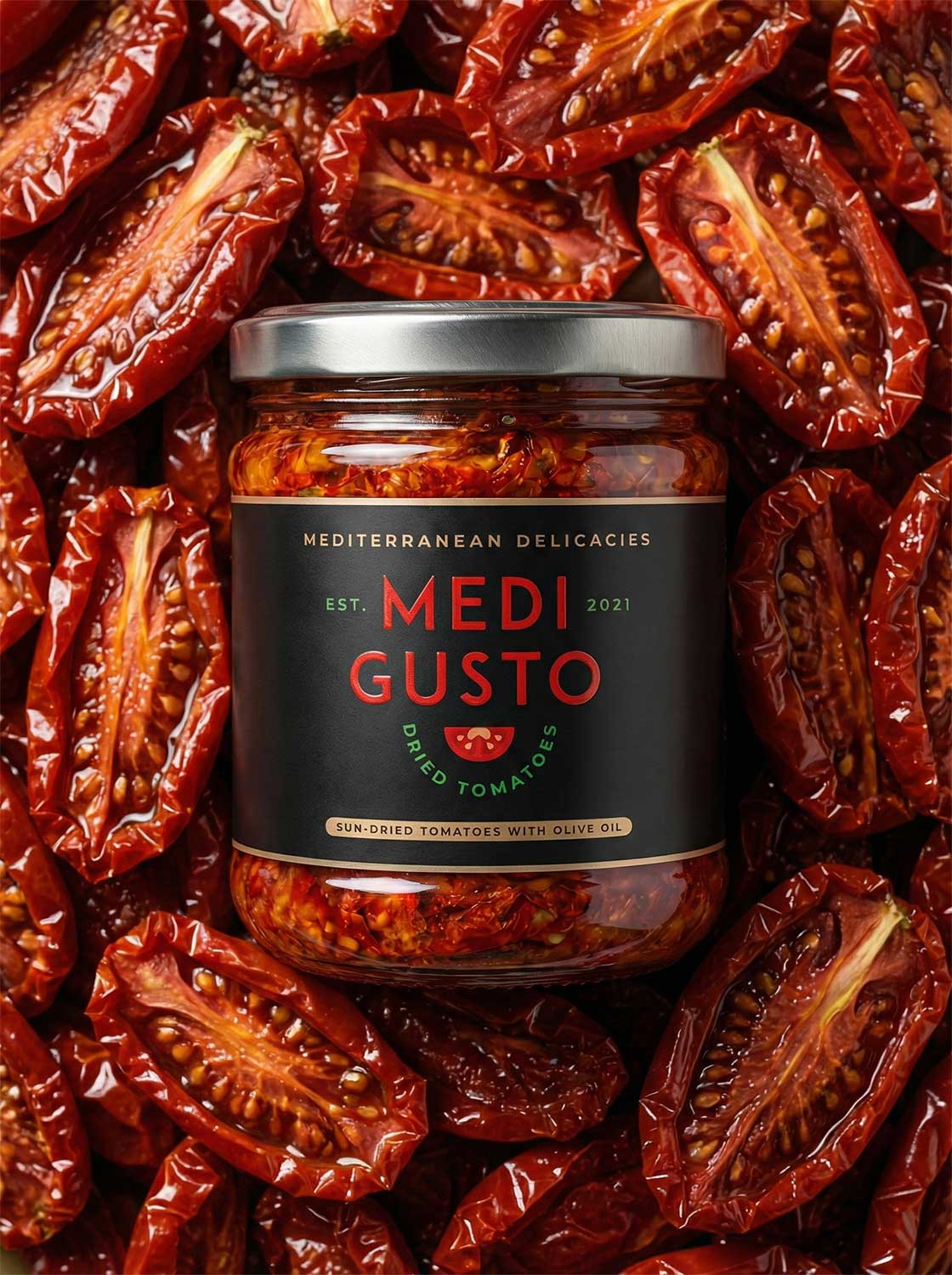
Medigusto
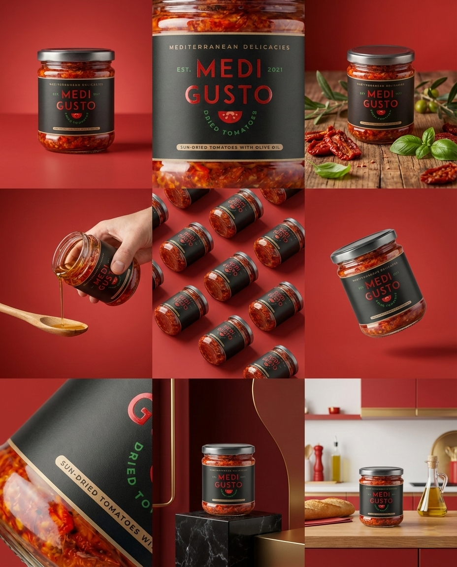
To meet this challenge, I harnessed the power of harmony and contrast by pairing a matte black background with the vivid red of fresh tomatoes, “vine-fresh” greens, and elegant gold accents. In designing the label, I strategically left open areas to highlight the product’s natural color and established a strong typographic hierarchy to give the brand a distinct, characteristic presence.
Task
Medigusto approached me with a clear vision: to elevate their sun-dried tomatoes from a pantry staple to a "gourmet gastronomy experience." The brief was to create a visual identity that appeals to the modern urban palate—communicating 100% natural ingredients through a lens of sophistication. They needed me to balance "organic roots" with a "premium shelf presence.